
In today’s fast-paced, data-driven world, businesses generate massive amounts of data daily, spanning from customer interactions to operational metrics. This explosion of data has made data visualization crucial in simplifying the process of understanding and analyzing complex datasets.
The ability to visually represent data allows businesses to quickly identify trends, make informed decisions, and communicate insights more effectively. However, the sheer volume of data often requires data visualization tools that are sophisticated enough to handle the complexity while remaining user-friendly.
Data visualizations’ role in simplifying data analysis has never been more significant. It assists in transforming unstructured, intimidating statistics into visual aids like dashboards, graphs, and charts that make decision-making and understanding simpler. Modern data visualization software is essential for businesses to gain a competitive edge by turning data into actionable insights.
Given the complexity of contemporary data, specialized data visualization programs are necessary to process, organize, and present this information effectively. These tools streamline data analysis and reporting, making them indispensable for modern business operations.
The purpose of this blog is to explore the top data visualization tools available, highlighting their features, pricing structures, and best uses to help you choose the right one for your needs.
Criteria for Choosing Data Visualization Tools
It’s important to take into account a number of things when choosing data visualization software to make sure it fulfills your needs:
- Ease of Use: How intuitive is the software? Does it require advanced technical skills, or is it accessible to all users?
- Scalability: Can the tool handle large datasets, or is it better suited for smaller projects?
- Customization: Does the software allow for tailored visualizations, including custom charts and dashboards?
- Integration: How well does the tool integrate with other platforms and databases?
- Cost: Is the pricing model suitable for your organization’s budget?
- Support and Community: Does the tool offer robust customer support or have an active user community for troubleshooting?
- Advanced Features: Are there unique features like AI-driven insights or real-time data updating?
How to Select the Ideal Data Visualization Tool for Your Needs?
The needs and complexity of the data in your organization will determine which data visualization tool is best for you based on a number of variables. Here are some pointers for making informed decisions:
- Assess Data Complexity: Tools like Tableau and Qlik Sense are ideal for large datasets and complex analytics, while Excel or Infogram may suffice for smaller, more straightforward datasets.
- Consider Your Team’s Technical Expertise: If your team has limited technical skills, opt for easy-to-use tools like Power BI, Google Data Studio, or Infogram. Developers or technical teams might prefer more customizable platforms like D3.js or Looker.
- Evaluate Budget Constraints: Tools range in cost from free (Google Data Studio) to premium (Tableau, Looker). Smaller businesses might want to start with affordable or free tools like Power BI or Zoho Analytics.
- Integration Needs: Choose tools that integrate with your current systems, such as Google Data Studio for Google products or Power BI for Microsoft ecosystems.
- Scalability: Make sure the tool you’ve selected can grow with your organization if you expect a rise in data. This is especially crucial for businesses that are expanding quickly.
- Collaboration Requirements: If multiple teams need to work together on reports, tools like Tableau, Power BI, or Zoho Analytics with collaboration features are ideal.
By carefully considering all of these variables, you may select a tool for visualizing data that meets your organization’s needs and allows for effective decision-making.
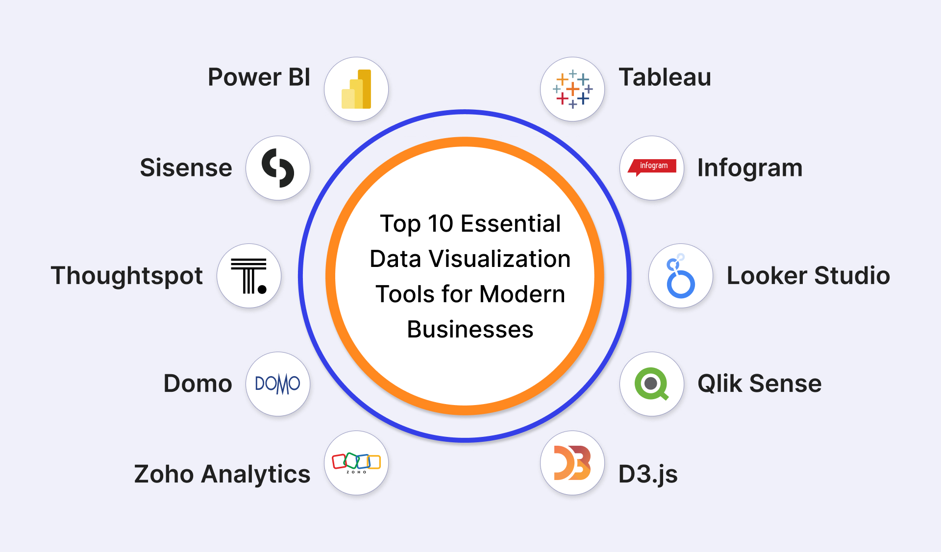
Top 10 Essential Data Visualization Tools for Modern Businesses
Recognizing the advantages, disadvantages, and appropriateness of each data visualization tool for a given task is essential to choose the best one. Below is a breakdown of the top tools based on features, usability, and pricing.
Tableau
Tableau is known for its advanced analytics and sophisticated visualizations, making it one of the top choices for enterprises dealing with complex datasets. Its drag-and-drop interface facilitates smooth data interaction.
- Key Features: Advanced analytics, AI-powered insights, interactive dashboards, large-scale data handling.
- Pros: Ideal for in-depth analytics; integrates with many data sources.
- Cons: Expensive; learning curve for beginners.
- Best Suited For: Large enterprises needing robust, scalable data visualizations.
Power BI
Power BI is a powerful, affordable tool that integrates seamlessly with Microsoft products, offering strong analytics and interactive reporting. It’s highly popular for its ease of use and wide range of features.
- Key Features: Integration with Microsoft products, real-time reporting, pre-built dashboards.
- Pros: Cost-effective; great for businesses already using Microsoft tools.
- Cons: Limited customization options compared to Tableau.
- Best Suited For: Small to medium businesses using Microsoft Office products.
Looker Studio
A free platform, Looker Studio provides a simple way to create interactive reports and dashboards with easy integration into Google Analytics, Google Ads, and other data sources.
- Key Features: Real-time collaboration, templates for fast setup, data blending.
- Pros: Free; excellent for web analytics.
- Cons: Restricted possibilities for visualization.
- Best Suited For: Digital marketers and small-scale enterprises use Google tools.
Qlik Sense
Qlik Sense is an AI-powered platform designed for self-service data visualization, allowing users to explore data with minimal technical expertise. It is very good at processing big datasets quickly and precisely.
- Key Features: AI-driven insights, self-service analytics, multi-cloud deployment.
- Pros: Advanced AI features; highly scalable.
- Cons: Can be pricey; steep learning curve.
- Best Suited For: Large organizations with complex data analysis needs.
D3.js
D3.js is an open-source JavaScript toolkit that provides highly customisable visualizations. It’s perfect for developers that want complete control over the presentation of their data.
- Key Features: Fully customizable, open-source, supports dynamic data-driven documents.
- Pros: Unlimited customization; free to use.
- Cons: Requires coding knowledge; not beginner-friendly.
- Best Suited For: Developers and technical users.
Infogram
Infogram is a cloud-based tool for creating infographics, reports, and basic data visualizations quickly. It is simple to use and designed with social media marketing and content creation in mind.
- Key Features: Pre-designed templates, drag-and-drop interface, interactive maps.
- Pros: Great for non-technical users; easy to use.
- Cons: Limited advanced analytics.
- Best Suited For: Marketing professionals and content creators.
Zoho Analytics
A versatile tool for data visualization used in corporate intelligence and reporting is called Zoho Analytics. It offers powerful data integration capabilities and customization options at an affordable price.
- Key Features: AI-driven analytics, data blending, customizable dashboards.
- Pros: Affordable; highly customizable reports.
- Cons: Limited third-party integrations.
- Best Suited For: Small to medium-sized businesses.
Domo
Domo is a cloud-based business intelligence platform that connects to various data sources and offers real-time analytics with a user-friendly interface.
Key Features: Real-time data access, mobile-first design, integration with 1000+ apps.
Pros: Scalable for large teams; intuitive dashboards.
Cons: Expensive for small businesses.
Best Suited For: Large enterprises requiring real-time data visualization and collaboration.
Sisense
Sisense provides a robust end-to-end data analytics platform that handles complex datasets, with strong capabilities for embedding analytics into applications.
Key Features: In-chip processing, AI-driven insights, embeddable analytics.
Pros: Highly customizable; scalable for large datasets.
Cons: Can be difficult to implement for non-technical users.
Best Suited For: Enterprises needing customized, embedded analytics.
Thoughtspot
Thoughtspot leverages AI and machine learning to deliver self-service analytics, enabling users to explore data through natural language queries.
Key Features: Search-driven analytics, AI insights, real-time reporting.
Pros: Easy-to-use search functionality; strong AI features.
Cons: High cost; limited custom visualization options.
Best Suited For: Enterprises looking for AI-powered, search-based data exploration.
Top 5 Tips for Getting the Most Out of Your Chosen Data Visualization Tool
Once you’ve chosen the right data visualization tool, it’s important to use it effectively to extract the most value from your data. The following advice will help you succeed:
- Know Your Data Inside and Out: Before creating visualizations, make sure you thoroughly understand the data you’re working with. Familiarize yourself with the variables, trends, and any limitations to ensure accurate and meaningful visuals.
- Specify Your Goals: You should always begin by identifying your objectives. Define what you want your visualization to convey—whether it’s tracking KPIs, highlighting trends, or making comparisons—this will guide your choice of charts and graphs.
- Keep It Simple: Steer clear of overloading your viewers with intricate visuals or copious amounts of data. Use clean, simple charts to effectively communicate key insights. Overloading visuals can dilute the message and confuse viewers.
- Leverage Interactive Dashboards: Allow consumers to further explore the data by including interactive tools such as filters, drill-downs, and clickable elements. Tools like Tableau and Power BI excel at creating engaging, interactive dashboards.
- Regularly Update Visualizations: Maintain your dashboards and reports up to date with the most recent data. If your tool supports real-time data integration, set up automatic refreshes to ensure your team is always looking at the most current information.
By following these tips, you can maximize the effectiveness of your data visualization tool and ensure your data-driven insights are both impactful and actionable.
Also Read: Data Visualization In Business Intelligence: How To Make Data Easy To Understand
Comparing the Tools: Strengths and Weaknesses
When selecting a data visualization tool, it’s important to weigh both the strengths and weaknesses to match your business needs. The right tool will align with your data complexity, team skill set, and project scalability. While some tools offer advanced customization, others prioritize ease of use or affordability. By identifying the unique strengths and limitations of each tool, businesses can optimize decision-making and streamline workflows.
Strengths
- Specialized Industry Features: Some tools offer industry-specific templates and features (e.g., healthcare, finance), enhancing relevance and reducing setup time.
- Real-Time Data Capabilities: Tools with real-time analytics enable businesses to make data-driven decisions instantly, which is critical in fast-paced industries.
- Enhanced Security Features: Tools that provide built-in encryption and compliance measures, such as GDPR and HIPAA, ensure that sensitive data is handled securely.
- Collaborative Cloud Solutions: Cloud-based platforms offer seamless collaboration between teams across different geographies, ensuring real-time input and updates on dashboards.
Weaknesses
- Steep Learning Curve: Some advanced tools, though feature-rich, require significant training or technical knowledge, making them inaccessible to non-technical users.
- Limited Customization for Entry-Level Tools: While user-friendly, basic tools may lack the depth of customization needed for complex data sets, limiting visualization options.
- Hidden Costs: Many tools offer basic packages at low prices but incur additional costs for necessary add-ons like advanced features or higher data limits.
- Integration Issues: Certain tools struggle with integrating smoothly into existing systems, requiring time-consuming workarounds or additional software to bridge gaps.
Choosing the Perfect Data Visualization Tool
Selecting the right data visualization tools is critical to transforming complex information into actionable insights. Whether you’re a business seeking to visualize customer data or an analyst needing to present financial trends, there’s a wide range of data visualization programs that cater to different needs.
By considering the features, pricing, and capabilities of each tool, you can choose the one that best aligns with your goals and expertise. As data continues to grow in complexity, future developments like AI-driven insights, real-time processing, and enhanced customization will further streamline decision-making. Businesses can remain relevant amid an ever-changing landscape by selecting the proper technology and maximizing its benefits.

