
Businesses create enormous volumes of data every day in contemporary data-driven surroundings. Given the increasing prevalence of digital transformation and sophisticated analytics, it is imperative to possess the capacity to comprehend and extract practical insights from this data.
Enter Business Intelligence (BI)—a set of strategies, tools, and processes that allow businesses to transform raw data into meaningful insights. One of the most critical elements of BI is data visualization, which helps convert complex datasets into easy-to-understand, visually appealing formats.
As data complexity increases, organizations are relying more on BI data visualization to interpret vast amounts of information. This is crucial for not only displaying data but ensuring it’s comprehended and actionable. Business intelligence, powered by effective visualization, has become a key driver of business growth, transforming raw data into strategic insights that propel informed decision-making and competitive advantage. This synergy between BI and visualization helps bridge the gap between complex analysis and business success.
What is Data Visualization in Business Intelligence?
Data visualization in the context of Business Intelligence (BI) refers to the strategic graphical representation of data. Through charts, graphs, maps, and other visual tools, complex datasets are simplified for quicker interpretation. By turning raw data into digestible formats, decision-makers can instantly identify patterns, trends, and outliers. Whether through business intelligence charts or other visual techniques, the aim remains the same: to enhance accessibility and drive informed, data-driven decisions.
The Unique Role of Data Visualization in Business Intelligence
Data visualization in BI plays a pivotal role in simplifying complex datasets, enabling users to interpret data patterns, trends, and outliers swiftly. It transforms raw data into visually engaging formats that enhance decision-making processes at all levels of the organization.
Here are key roles of data visualization in BI:
- Simplifying Data Complexity: Visualization break down complex datasets into intuitive visuals, making it easier for stakeholders to comprehend and act on insights.
- Enabling Real-time Insights: Live data dashboards give firms instant information and enable them to react to changes efficiently and promptly.
- Facilitating Data Exploration: With interactive features like filters and drill-down options, users can explore data from different perspectives and uncover hidden insights.
- Improving Decision-Making: Visual representations of key performance indicators (KPIs) and trends help decision-makers grasp essential information at a glance, speeding up the decision-making process.
- Encouraging Cross-team Collaboration: Business visualization create a shared understanding of data across departments, fostering collaboration and aligning goals.
- Spotting Trends and Outliers: Visual tools make it easier to spot trends, anomalies, or outliers in large datasets, leading to faster corrective actions.
- Enhancing Storytelling: Visualization helps craft a narrative around data, making it more compelling and easier to communicate to stakeholders.
Advanced Visualization Techniques for BI
To maximize the effectiveness of BI data visualization, several advanced techniques are used to display data in insightful ways. These include:
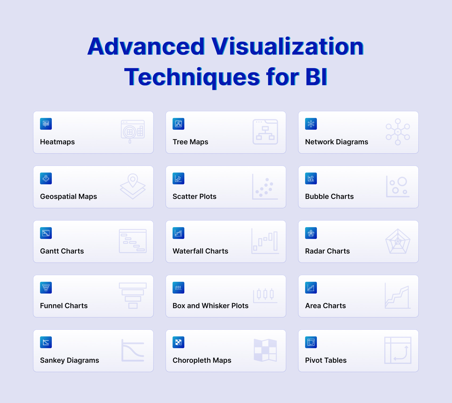
Such data visualization techniques enhance the ability of BI to communicate more complex relationships in data, going beyond basic charts and graphs.
Principles of Effective BI Data Visualization
For business intelligence visualization to be more effective, the following principles must be adhered to:
- Clarity: Visuals must be easy to interpret. Overcomplicated charts with too many data points can confuse rather than inform.
- Accuracy: Ensure that the visual accurately reflects the underlying data. Misleading charts can lead to poor decision-making.
- Relevance: Only visualize data that is crucial to the decision-making process. Too much data can lead to information overload.
- Consistency: Use a uniform format for your visualizations across reports to create a consistent user experience.
- Engagement: Interactive elements like filters and drill-down options should be integrated to allow users to explore the data more deeply.
- Accessibility: Ensure that the visualization is understandable to both technical and non-technical users. Avoid jargon and use clear labels and legends.
- Proper Use of Color: Color should be used strategically to highlight key data points, distinguish between categories, and avoid confusion. Overuse of color can make the data harder to interpret.
- Data Context: Provide context to the data being visualized by including comparisons, benchmarks, or historical data trends. This helps users understand whether the data is performing well or poorly.
- Avoid Distortion: Always ensure that visual representations of data are not exaggerated or minimized. Distortions, like truncated axes or 3D effects, can mislead viewers.
- Focus on Key Metrics: Highlight key performance indicators (KPIs) or important data points that are relevant to the user’s goals, ensuring they stand out in the visualization.
By following these principles, businesses can ensure they create beautiful data visualizations that communicate insights effectively.
Let’s Check How to Make Data Easy to Understand in BI
Making data easy to understand is the primary goal of BI systems. In today’s fast-paced business environment, organizations generate vast amounts of data that can be overwhelming without proper structuring and visualization. By transforming this data into intuitive and actionable insights, Business intelligence systems enable decision-makers to quickly identify trends, opportunities, and potential risks. This is where data visualization comes in handy—it bridges the gap between complex statistics and simple visual insights, allowing businesses to make better decisions faster.
Here’s how to make data easy to understand in Business Intelligence:
1. Use the Right Visualization Tools
The foundation of making data easy to understand is selecting the right BI data visualization tools.Numerous chart kinds and customization options are available in tools like Power BI, Qlik, and Tableau to help you customize data presentations to meet your unique business objectives. These tools simplify data for non-technical users by providing visuals that explain complex datasets at a glance. Choosing the right tools also ensures the data’s integrity while keeping the user experience in mind.
2. Choose the Correct Visuals for Data Representation
Selecting the right chart or graph for the data is key to effective business intelligence visualization. Utilizing the incorrect visualization might cause confusion or misinterpretation because different types of data call for different views. For instance, using pie charts to display trending data over time can be ineffective, whereas line graphs would be a more appropriate choice.
- Bar Diagrams: Excellent for comparing different categories.
- Line Charts: Best for displaying long-term patterns.
- Pie Charts: Useful for showcasing sections of a larger piece of art.
- Heat maps: Ideal for displaying data density or frequency.
The right selection of business intelligence charts makes complex information digestible and easy to interpret, providing clear insights that drive decision-making.
3. Focus on Simplicity and Minimalism
One of the key principles of bi data visualization is simplicity. Data should be presented in a way that avoids clutter and unnecessary complexity. Excessive use of colors, labels, and complex graphs can overwhelm users, making it harder to extract meaningful insights. Instead, focus on a minimalist design that clearly highlights important data points.
- Keep visualizations clean: Make use of plain axis labels, simple typefaces, and less colors.
- Avoid unnecessary 3D effects: While 3D charts may look appealing, they often distort data and can make interpretation harder.
In business intelligence and data visualization, simplicity guarantees that the most pertinent information is highlighted and accessible to a wide audience.
4. Interactive Dashboards
Interactive dashboards are another powerful way to make data more understandable in BI systems. Users can study the data in more depth and have more freedom in how they interpret it with the aid of dashboards that let them drill down into the data, filter the data, or alter views. This exchange encourages more in-depth comprehension and participation.
5. Leverage Color Wisely
Colors play a major role in the success of business intelligence data visualization. When used correctly, colors can highlight key insights and improve the readability of charts. However, misuse of colors—such as using too many bright or contrasting colors—can overwhelm viewers and dilute the message.
- Use color to highlight key metrics: For example, use red for underperforming areas and green for those exceeding expectations.
- Maintain consistency: Use the same color schemes across similar data categories to ensure clarity and coherence.
Color in bi visualization tools should be used strategically to focus attention on the most critical areas, without distracting from the overall visualization.
6. Tell a Story with Data
One of the most effective ways to make data understandable is to tell a compelling story. Data storytelling is the process of presenting information in a way that makes sense to the audience and aids in understanding the background, context, and consequences of the data. This method goes beyond simply showing graphs and figures to tell a story that illuminates the meaning behind the facts.
7. Use Data Context and Annotations
Adding context to data visualizations in the form of annotations or comparative benchmarks can greatly enhance the understanding of BI visuals. Context can include historical data comparisons, industry benchmarks, or even commentary on what the data signifies. This additional layer of information helps to guide users in interpreting the visualization.
- Annotations: Highlight important spikes, drops, or anomalies in the data directly on the chart.
- Comparative Data: Show how current data compares to past performance, industry standards, or key benchmarks.
Providing context helps the viewer understand the “so what” of the data, allowing for a quicker and more accurate interpretation of BI reports.
8. Real-time Data Visualization
Many BI tools and processes offer real-time data visualization capabilities, where dashboards and reports are constantly updated as new data streams in. This dynamic feature ensures that businesses are working with the latest information, allowing for quick decision-making and responsive actions based on the most current insights.
9. Ensure Accessibility and Usability
To make data easy to understand, it’s essential that bi tools for data visualization are accessible to both technical and non-technical users. This involves designing intuitive dashboards, adding tooltips, and creating visuals that don’t require extensive data expertise to interpret.
- Tooltips: Give more details when a user mouses over particular data points.
- Drill-down capabilities: Allow users to explore deeper data layers without overwhelming them upfront.
Ensuring that bi data visualization is accessible and user-friendly across the organization will make it easier for everyone to understand and act on the data.
Common Pitfalls in BI Data Visualization and How to Avoid Them
When implementing BI data visualization, businesses may fall into common pitfalls that reduce the effectiveness of their visualizations:
- Overloading with Data: Including too much data in one visualization can overwhelm the user. To avoid this, use separate charts or dashboards for different datasets.
- Poor Chart Selection: Choosing the wrong type of chart for the data can mislead viewers. For instance, using a pie chart for comparative analysis may not provide the clarity a bar chart would.
- Neglecting the Audience: Creating visuals without considering the end user’s technical ability can result in miscommunication. Ensure that your business intelligence charts are tailored to your audience.
- Ignoring Interactivity: Lack of interactivity can result in static and less engaging visualizations. Incorporating BI that allow users to filter or drill down into the data is essential.
By avoiding these pitfalls, businesses can create more efficient and user-friendly BI visualizations.
How Data Visualization Drives Better Decisions in BI?
Business intelligence and data visualization play an essential role in facilitating better decision-making. By turning complex data into visually intuitive formats, decision-makers can spot trends, monitor KPIs, and identify anomalies quickly. This ability to visually interpret data accelerates the decision-making process, reduces errors, and allows businesses to adapt to changes in real-time. For instance, BI visualization tools can track sales trends, supply chain bottlenecks, or customer behavior patterns, driving more informed decisions.
Real Life Use Case of Data Visualization
GetOnData developed data dashboard for a US-based retail business
GetOnData developed a personalized data dashboard for a retail business in the USA to simplify data analysis and decision-making. By integrating data from multiple sources and employing AI-driven analytics, the company improved decision-making efficiency by 80% and increased operational productivity by 60%, leading to a 50% revenue growth and optimized marketing strategies.
Future Trends in BI Data Visualization
As BI evolves, the future of data visualization is advancing with cutting-edge technologies. Emerging trends are reshaping how businesses interact with data, making insights more intuitive and impactful.
- AI-Driven Visualizations:
AI-driven visualization will automatically detect patterns in data and generate insightful visualizations, reducing the need for manual analysis. This will help businesses identify trends and anomalies faster. It enables more proactive decision-making through smart, real-time data insights. - Augmented Analytics:
By combining data visualization with machine learning, augmented analytics will offer automated insights and recommendations. Because of this, consumers with no technical expertise can understand complicated data with ease. It streamlines decision-making through predictive analytics and smart suggestions. - Immersive Visualizations:
Immersive visualizations will enable people to interact with data in 3D environments thanks to developments in VR and AR. Businesses will experience data in a more engaging, intuitive way. This will enhance analysis and understanding of complex datasets.
These trends will ensure that BI data visualization remains at the forefront of decision-making for businesses in the coming years.
Power of Data Visualization in Business Intelligence
Data visualization in Business Intelligence (BI) serves as a vital tool for transforming complex data into easily digestible and actionable insights. By leveraging advanced visualization techniques, businesses can simplify data interpretation, drive informed decision-making, and foster cross-team collaboration. Effective BI strategy with data visualization goes beyond just displaying information—it tells a compelling story, offering clarity, context, and real-time insights that align with organizational goals.

