Optimizing Retail Performance With Looker for A Major US Retailer

Client Overview

The client is one of the giant retailers in the US that offers a variety of food supplies, and services. They have a strong

reputation for providing high-quality products and outstanding customer service.

Client Requirements

Create a looker dashboard to automate the Cost Per Unit calculation process for each variable between the current and previous fiscal year to eliminate the manual ETL and CPU calculation process in excel from Snowflake data tables.

Build a looker dashboard to track the actual vs projected values for each variable for the current fiscal year and showcase the actual values for each variable for the previous fiscal year.

Our Solution

Bullet point

Queried a data pipeline to transform and load raw data from various platforms into the targeted tables in Snowflake.

Bullet point

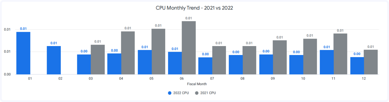
Built multiple bar graphs to project the monthly and yearly CPU values between both the fiscal year for each variable.

Bullet point

Added week, month, and a variable filter to show the desired CPU values based on the user selection.

Bullet point

Created multiple single-value card graphs to show this year’s vs. last year’s weekly, monthly, and yearly CPU values as well as calculated WoW, MoM, and YoY % change values for the selected variable.

Bullet point

Created an overview table to show the CPU values for both fiscal years for all the variables.

Looker CPU Monthly Trend Dashboard
Bullet point

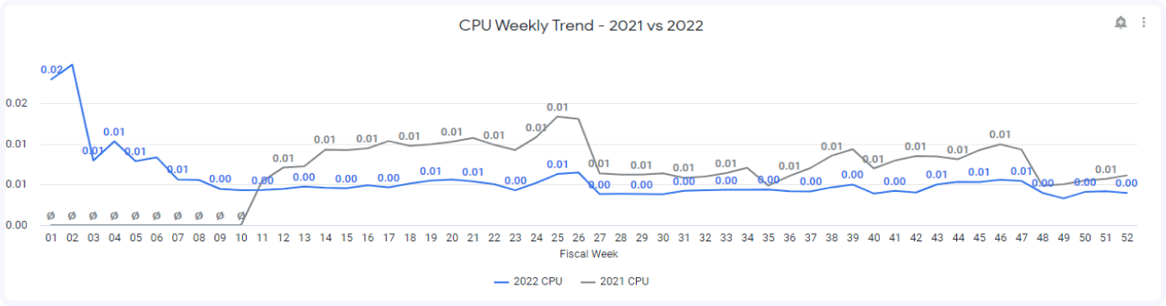
Created a line chart to project the actual as well as the forecasted values for the current fiscal year and actual values for the previous fiscal year.

Bullet point

Added a variable filter to showcase the actual and estimated values for both fiscal years based on the user-selected variable.

Looker Cost Per Unit Dashboard

Client Benefits

Runtime Reduction

60% reduction in runtime for transition from manual data load in excel to looker database.

Decision-Making Aid

Dashboards provide valuable insights about the data behavior and market changes which helps to take better decisions.

Single View

Showcasing multiple graphs and charts as a single view which helps the users to understand data trend-lines quickly and efficiently.

Easy To Share

Dashboards can download into different formats and it can share to stakeholders, users, analyst via email or in group chats.

Case Studies

Start your journey towards data-driven excellence.